Presentations
Crafting a winning presentation is essential to successful communication. Whether you need to convince your team to get on board with a new idea or inspire your clients with your vision, we're here to help you create a presentation that hits the mark. Our guidelines will ensure your deck is clear, concise, and visually engaging, leaving your audience feeling informed and inspired.
Please note that the rules we highlight on this page are primarily for Keynote, our main presentation software. For other presentation software, there are slightly different guides that can be obtained by
contacting our designers. However, basic elements such as colors and fonts remain consistent across all tools. Read about tools more in the section below.
Storage
In our storage (Google Drive), you can access all the presentations that our designers have created. To make modifications, simply save the files to your computer. If you need to make changes to the files in the storage, please reach out to us through the
#design Slack channel. We are happy to assist you!
Template
For creating your presentations, we highly recommend using our presentation template. It includes a library of slides for various needs. These slides are also listed on the left panel of the interface for your convenience. You may easily remove any slides that are not necessary for your presentation. For more detailed information, please refer to the "How to Use the Template" section.
The presentation template includes:
- 4 cover slides with unique visual designs
- 3 bumper slides that you can use to divide different sections of your presentation
- 4 accent slides to emphasize and visually distinguish short statements within your presentation
- 20 text slides with different numbers of columns, suitable for text content of any length, with or without icons or bullet points, and with or without media such as pictures or illustrations (for more information about slides with illustrations, please see below)
- 4 chart slides. These slides are not included in the template's slide library, but are listed on the left panel for easy access
- 2 "Thank You" closing slides
- 23 slides with illustrations. Please note that these slides are not listed on the left panel due to their large quantity and can only be accessed from the template slides library
- 2 blank slides with white and dark backgrounds that can serve as a foundation for any of your ideas
- 6 hidden on the left panel technical slides with text styles and grids that you can use as a basis for your work
If you have any suggestions or requests for the template, please don't hesitate to let us know on the
#design Slack channel. We are always happy to improve and update our resources to better meet your needs.
Additionally, you can use any presentation from the storage as a reference for the design elements. While not a proper template, it can serve as a starting point for making text changes.
The design principles that are applied to our templates and presentations in storage can be found below, providing guidance for creating visually appealing and impactful presentations.
Grid
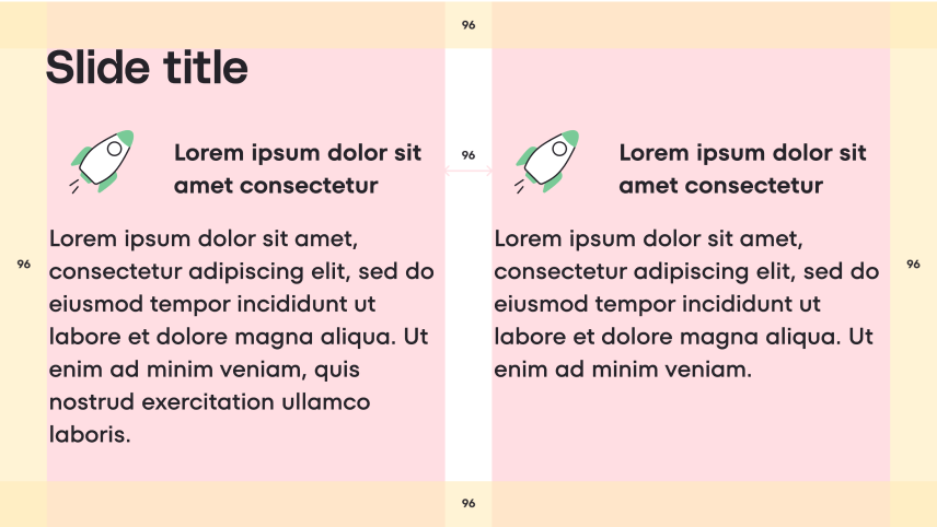
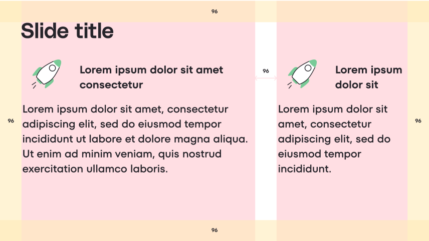
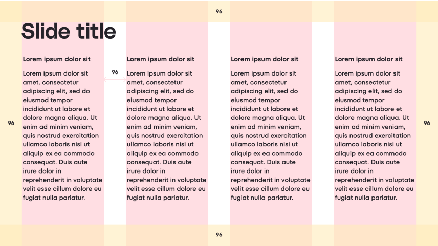
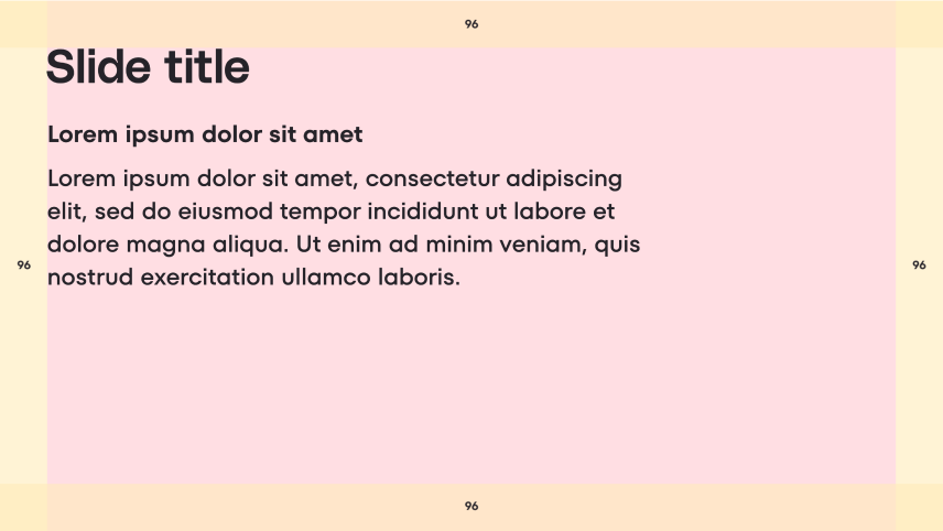
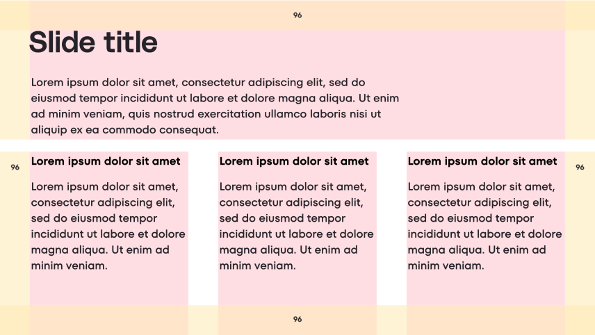
In slide design, utilizing a grid is essential for enhancing readability and facilitating information comprehension. This becomes particularly beneficial when dealing with slides that contain a substantial amount of text. Splitting the text into columns using a column grid with a 96pt margin (empty spaces between the edges of the format and the content) and gutters (spacing between columns) is the optimal solution.
Margins
While grids may not be necessary for slides with minimal text that can be accommodated in a single column, it is crucial to remember to maintain 96pt margins from the top, bottom, left, and right sides of the slides. These areas should remain empty (illustrations and visuals are exception sometimes), with the content placed inside, touching the top and left margins if aligned to the left, and touching the top only if centered.
Columns
We offer four types of grids to suit your needs:
- 2 columns grid (1:1)
- 2 columns grid (golden rule)
- 3 columns grid
- 4 columns grid
Select the appropriate grid based on the amount of content you have. The more content you have, the more columns will provide optimal results and ease of work. The entire presentation template is built upon these grids, but if you wish to experiment, there are slides with grids included in the template. Grids can also be combined if needed.
2 column grid (1:1)
2 column grid (golden ratio)

3 column grid
4 column grid
No grid
Combined grid
Flowlines
Flowlines play a crucial role in guiding the reader's eye and creating a structured layout. These horizontal lines aid in navigating the content and provide clear boundaries for placing elements. To assist you in maintaining consistent spacing between objects, we have included a slide with flowlines in the template. Utilize this slide to enhance the overall alignment and organization of your presentation.

For example, flowlines can assist you in determining the appropriate amount of space to allocate after a header, ensuring proper visual separation. They can also be used to measure the ideal spacing between vertically aligned paragraphs, promoting readability and maintaining a consistent flow throughout the presentation.
Colors
Below is a concise color guide specifically designed for presentations. We highly recommend following these guidelines to maintain a consistent Videoly brand identity and create visually appealing designs.
We recommend you to add the colors to your Mac library so you always have an access to them.
Color library on your Mac
Background colors
Background Colors: For the background colors of slides, white is the preferred choice. However, you can also use other colors to add dynamism to the presentation. Avoid placing colored slides consecutively, and aim to include at least one white background slide in between. In slides containing charts, a dark background can be used.
Most frequently used for the background
Exclusively used in slides with charts
Utilized for bumper or accent slides, often paired with illustrations from the same color family
Text colors
These colors apply to the text within slides. Black is predominantly recommended, but white can be used on dark Violet 800 slides with charts.
Most frequently used for the background
Used in slides with charts or on accent elements
Employed for secondary text or captions
Used for links or when highlighting specific text
Accent colors
When emphasis is needed, such as for labels or other graphic elements, the following accent colors can be used:
Primarily used for buttons or other accent elements
Used for labels, icons and other accent elements
Used for labels, icons and other accent elements
Used for labels, icons and other accent elements
Outline colors
In certain cases, creating cards or outlining elements in slides may be necessary. The following colors are recommended for outlines:
Used for card outlines, and sometimes as their background color
Utilized for card outlines
Typography
In order to facilitate the handling of text content in presentations, we have established a font hierarchy that offers flexibility and assists in creating slides with varying amounts of text while emphasizing key headings. We kindly request that you adhere to this hierarchy, as it ensures consistency across presentations and facilitates slide reuse. These styles are embedded into the presentation template for your convenience.
Download Videoly brand fonts and learn more about our brand typography
here.
Logotype
When incorporating the logo, ensure it has ample space to shine and maintain its prominence. By giving the logo room to breathe and avoiding visual clutter, you can effectively highlight its significance without overshadowing other elements.
For more information about our logo and to download it, please visit our designated page
here.
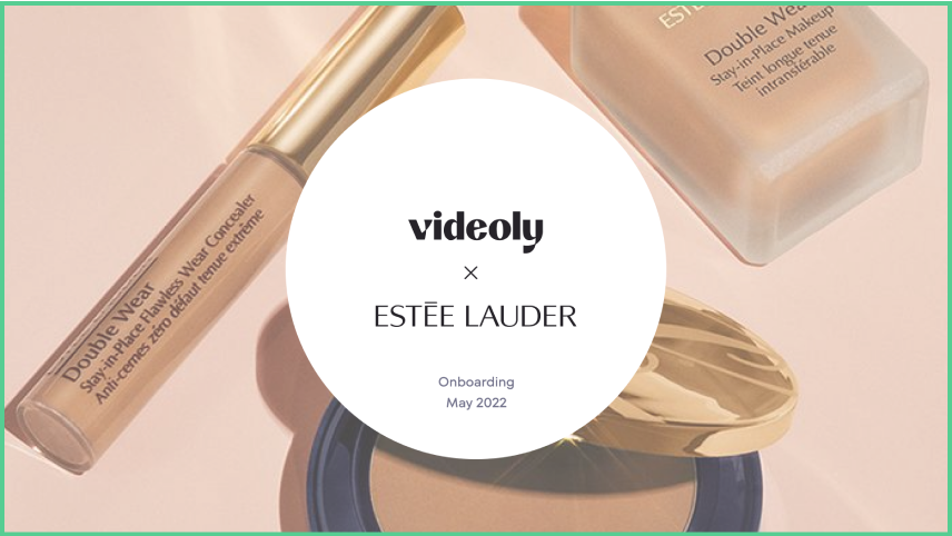
When showcasing a brand collaboration, it's important to visually balance the logos by ensuring they are of the same size. By adhering to this guideline, you can achieve a harmonious partnership between the two logos.
When showcasing a brand collaboration, please utilize our specially designed multiplication symbol (×) whenever possible, instead of using "x" letter. You can download it
here. Classic multiplication symbol (×) is also allowed to use. Copy it from this text and paste into the presentation.
Do

Don’t
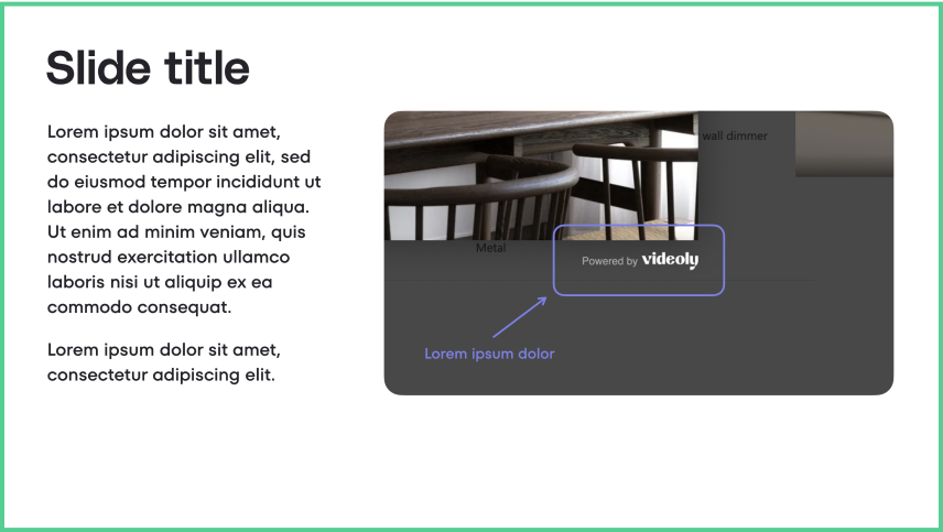
Screenshots
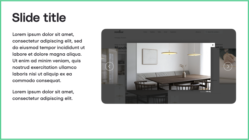
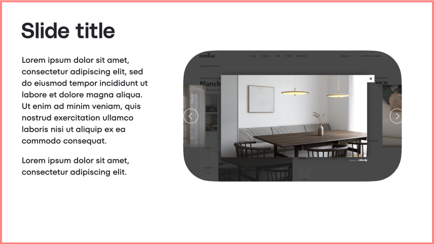
A screenshot is an image that displays the contents of a computer or mobile screen. It serves as a valuable resource for showcasing our product, highlighting widgets on customer pages, or achieving various other purposes. Here are instructions on how to capture screenshots on your Mac and how to highlight specific areas using our brand assets if necessary.
When incorporating screenshots into your presentation, please follow the recommendations provided below.
Corner roundness
Whenever possible, round the corners of your screenshots to align with our brand's visual style. Allow enough space around the content of the screenshot so that it is not cropped by the rounded corners. Make sure that the corner radius of all rounded rectangles in the presentation is moderate and visually consistent.
Do
Don’t
Colors
Ensure that the edges of the screenshot are distinguishable from the slide's background. Consider using Violet 800 as the background color to make the screenshot stand out. Alternatively, you can outline the screenshot with Neutral 100 or Neutral 200 colors using a line thickness of 1-4 points. Be mindful that none of the colors used in the screenshot's edges coincide with the slide's background. In such cases, utilize an outline to provide the necessary contrast.
Position
Depending on the format and aspect ratio of the screenshot, its optimal position may vary. A common and visually appealing placement is on the right side of the slide like in the examples above.
Highlights
If you want to draw attention to a specific area within the screenshot, use the Rounded Rectangle shape and select one of our accent colors. If you wish to draw attention to a specific area within the screenshot, you can utilize the Rounded Rectangle shape and choose one of our accent colors. Additionally, if you decide to use an arrow, we recommend employing the specific style of endpoint illustrated in the picture below.
Do
Mockups
Sometimes, you may want to showcase how the screenshot would appear in a real-world context. In such cases, you can use laptop or mobile mockups. Aspect ratio of mockups in most cases is the same that the ratio of your actual devices while the screenshot is taken with full-screen mode. Ensure that the mockups are placed on a white background only.
For added convenience, you can explore the creative possibilities of
shots.so. This tool provides an array of options for crafting captivating mockups.
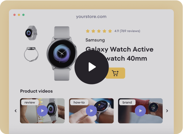
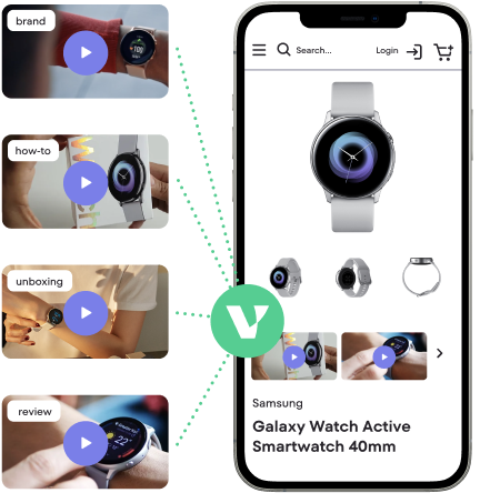
Products visuals
This section is continuously evolving, and in the future, you will find a comprehensive collection of visuals showcasing our Widget, Videoly for Retailers, and Videoly for Brands. Currently, we have one subsection available, focusing on our Widget.
Widget
Our Widget visuals consist of carefully crafted images and animations that replicate the appearance of real stores. Each store category is represented by three distinct versions, providing variety and flexibility for your presentations.

Desktop static
Desktop animated
Mobile static
Icons
Icons play a significant role in our design system, serving as attention-grabbing visual elements that aid in quick navigation and text comprehension. We encourage the use of icons as an alternative to traditional bullet points or as visual support to facilitate easy skimming of text.
Bullet points
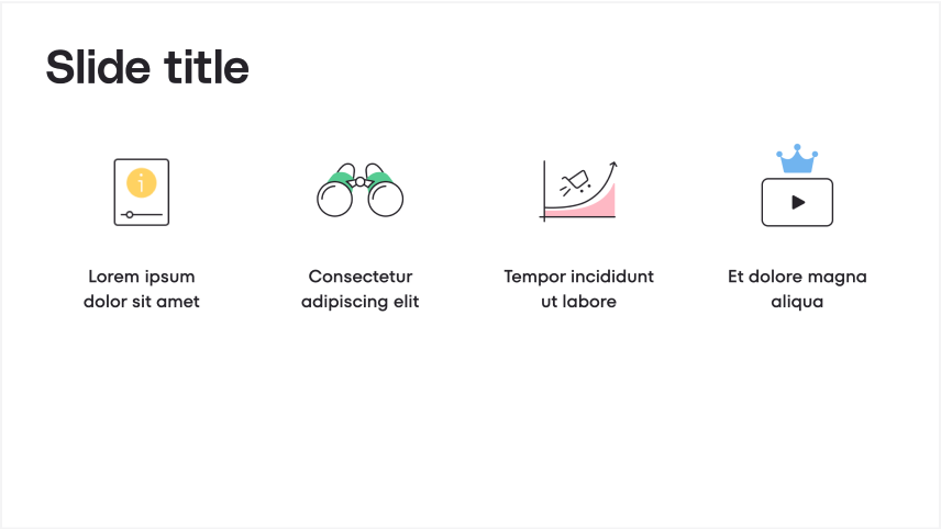
Icons
Colors
When you download an icon from our
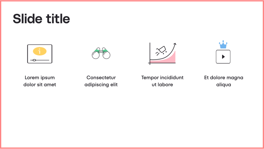
library, you will receive a package containing the icon in five different color variations. Each icon is provided as a PNG file with a transparent background. To ensure consistency, please use the icons on a white background only. When incorporating multiple icons within a single slide, we recommend selecting different colors for each icon without repetition, like in the example above. This practice adds visual variety and avoids monotony in the slide's composition.
Size and proportions
When adding an icon to the slide, set the optimal size of 220x220 pixels and stick to it in all slides. Please, do not distort the icons.
.png)
Do
Don’t
Set of icons
Discover a diverse collection of icons designed to enhance your presentations. These icons cover a range of concepts and topics, providing visual communication tools for your slides. Please note that while the categories may not be precise and the icons may represent multiple concepts, you can still explore and find relevant icons for your needs. If you can't locate a specific icon, feel free to reach out to us in the
#design channel on Slack. Download your desired icons by clicking the respective buttons and seamlessly incorporate them into your slides.
Videoly solution and products
Bullet points, Cards, Illustrations, Animations, Charts, Tables are coming soon.
These elements are currently under development and will be available soon. In the meantime, we encourage you to make use of the provided template, which already offers a wide range of visuals to effectively convey your message. If you have any questions or need further support, please don't hesitate to reach out to us on the
#design Slack channel. We're here to help and provide any assistance you may need!


